Data Grid
Overview
The Data Explorer provides powerful data viewing, filtering, and analysis capabilities in a grid view. You can sort and filter data, group and aggregate rows, adjust columns, export to CSV or Excel, and create charts from your selection. The following sections describe the main areas of functionality.
Learn more about integrated charts on the dedicated help page.
Key features:
- Custom Toolbar: Quick access to filters, column controls, density, and reset actions
- Column Management: Sort, resize, reorder, show or hide columns, and filter per column
- Row Grouping and Aggregation: Group by columns and apply sums, counts, or averages
- Filtering: Quick filter, column filters, and advanced filter builder
- Export: Export all or selected data as CSV or Excel
- Selection: Select rows or cells, copy, and use range selection
- Sidebar: Manage columns and filters in dedicated panels
- Status Bar: View row counts, selection count, and aggregation values
- Integrated Charts: Create charts from selected data
- Saved preferences: Grid layout and settings can be saved and restored
- Data Loading: How data is loaded and refreshed in the grid
- Accessibility: Keyboard navigation and screen reader support
Custom Toolbar
The toolbar provides quick access to common grid operations, organised into button groups. Use it to search across all columns, adjust column and row layout, change row density, reset filters or the whole grid, and toggle the advanced filter builder.

Key features:
- Quick Filter: A search input at the top of the toolbar searches across all columns simultaneously.
- Column/Row Controls: Toggle between auto-sized columns and fitted columns (shrink to fit). When grouping is enabled, expand or collapse all row groups at once.
- Density Controls: Dense (25px row height), Default (42px), or Relaxed (56px) for viewing more data or easier reading.
- Reset Actions: Clear Filters (removes filters, keeps column config), Reset Columns (resets columns, keeps filters and grouping), or Reset Grid (resets all settings).
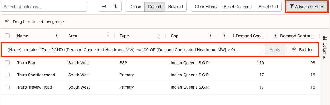
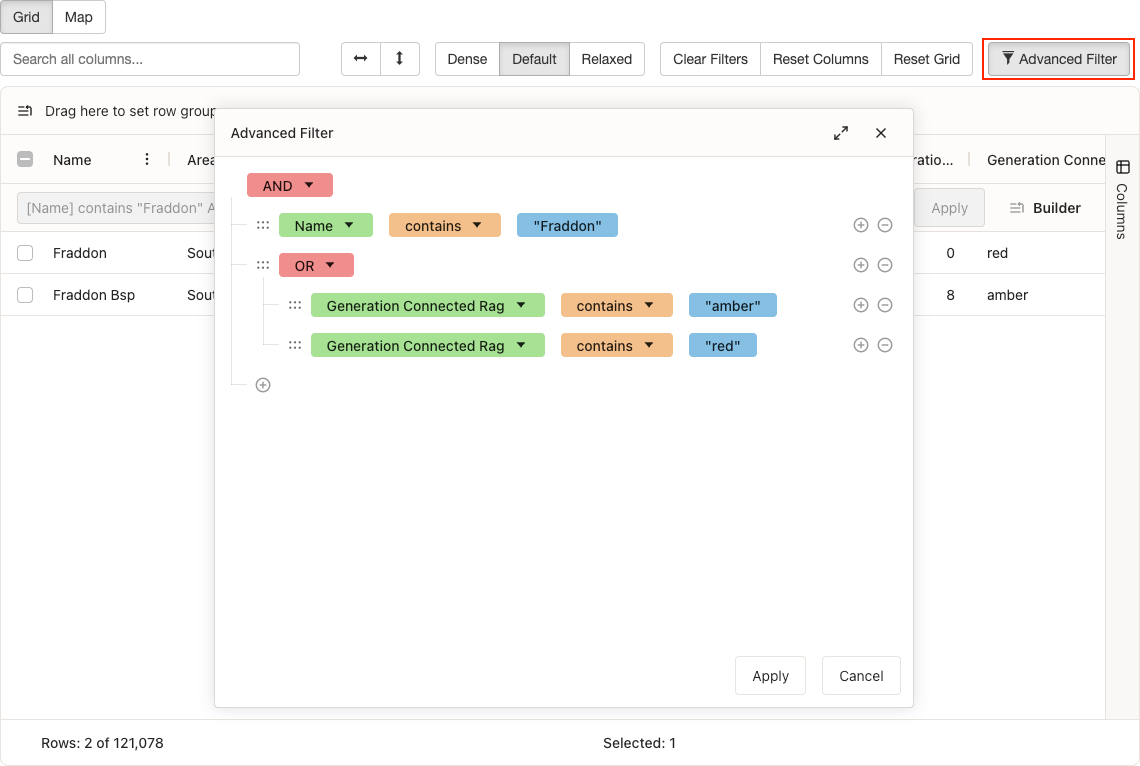
- Advanced Filter: Enable or disable the advanced filter builder for complex conditions with SQL-like syntax. When enabled, you can use the graphical query builder or enter the query directly; all other filter types are disabled.
Column Management
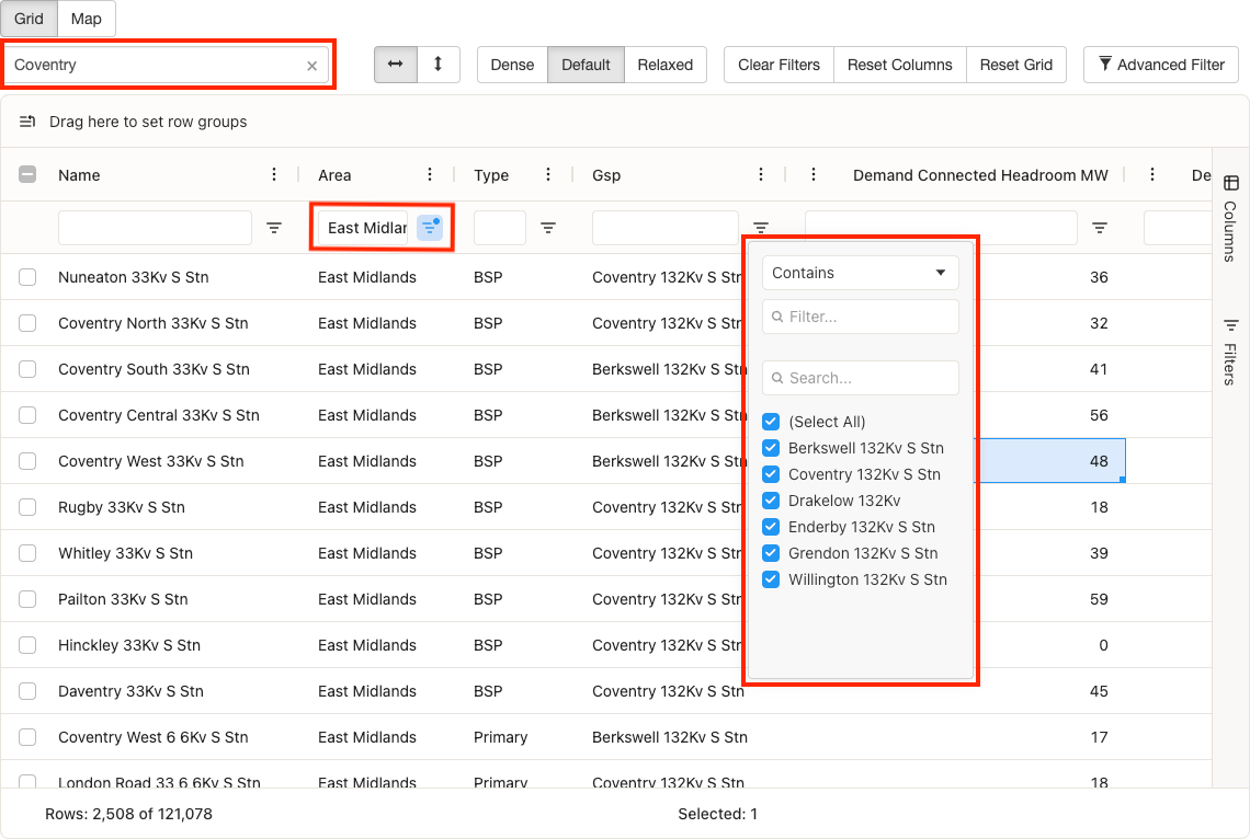
You can control how columns are displayed and how you interact with them. Sort, resize, and reorder columns to suit your view; hide columns by dragging them out of the grid and restore them via the Column Chooser or side panel. Each column also has its own filtering—use the input below the header for quick text filters, or the filter icon for type-specific options such as multi-select, number ranges, or date pickers.
Key features:
-
Sorting: Click column headers to sort in ascending/descending order.
Tip: Use Shift + click to sort by multiple columns. Keyboard users can press Enter or Space on a column header to sort. - Resizing: Drag column borders to adjust width
- Reordering: Drag column headers to reorder columns
- Context menu: Right-click the column header to access more options
-
Visibility: Drag a column header outside of the grid to remove it.
Tip: Add the column back using the Column Chooser in the context menu or the side-panel. - Quick Filters: Text boxes appear directly below each column header for quick filtering of that column using free text
- Dynamic Filters: Click the filter icon to reveal more advanced filters based on the column data type (multi-select for text, number range for numbers, date picker for dates)
Tip: If you lose track of your filters, reset them using the "Clear Filters" button in the toolbar. A highlighted filter icon indicates that a filter is active on that column.
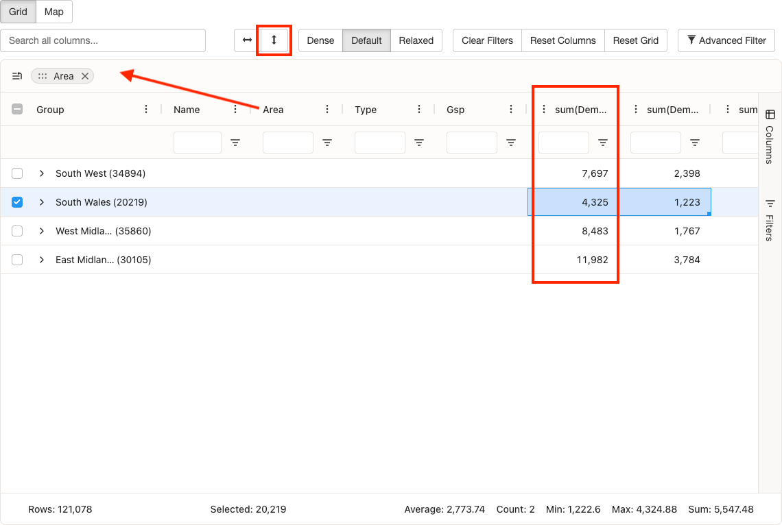
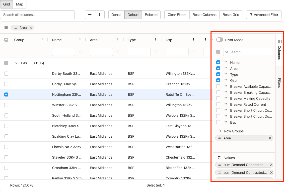
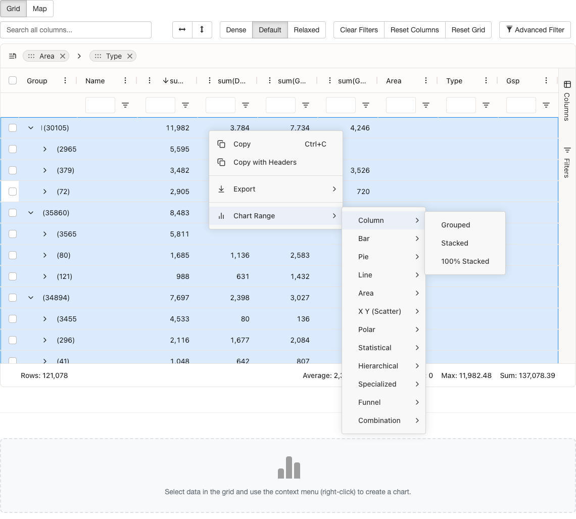
Row Grouping and Aggregation
You can organise and summarise data by grouping rows by one or more columns and applying aggregation functions. Grouping collapses rows that share the same value in the chosen column(s), making it easier to see patterns and totals. Numeric columns can show aggregated values (such as sum, count, or average) for each group. Use the row group panel to drag columns in and out of grouping, and expand or collapse groups to drill down into the data.
Key features:
- Row Grouping: Drag columns to the row group panel to group data by those columns
- Aggregation: Aggregation functions (sum, count, average, etc.) will be applied to columns that support them (numeric)
- Group Expansion: Expand or collapse individual groups, or use the toolbar button to expand/collapse all
- Group Selection: Selecting a group row selects all its child rows
Filtering
You can narrow down the data displayed in the grid using several filtering options. Whether you need a quick text search across all columns, column-specific filters, or complex multi-condition rules, the data explorer provides the right tool. Filtered results update immediately, and the status bar shows how many rows match your current filters.
Key features:
- Quick Filter: Search across all columns simultaneously using the quick filter input in the toolbar.
- Column Filters: Each column has its own filter accessible via the floating filter input below the header, or through the filter panel in the sidebar.
- Advanced Filter: Build complex filter conditions using the advanced filter builder, accessible via the toolbar button. Supports multiple conditions with AND/OR logic.
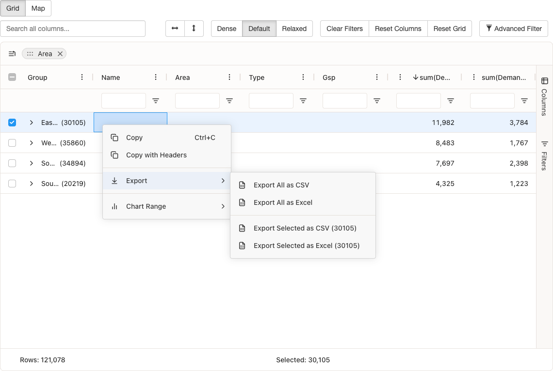
Export
You can export grid data to CSV (Comma-Separated Values) or Excel for use in other tools. Use the context menu (right-click on selected cells or rows) to choose whether to export the full dataset or only the rows you have selected. Exported data reflects the current view, including any active filters.
Key features:
- Export All as CSV: Export all grid data to CSV (Comma-Separated Values) format
- Export All as Excel: Export all grid data to Excel format
- Export Selected as CSV: Export only selected rows to CSV (Comma-Separated Values)
- Export Selected as Excel: Export only selected rows to Excel
Selection
You can select rows or cells to export, copy, or use as the source for charts. Row selection uses checkboxes for multi-select; cell and range selection let you work with specific data. Selections can be copied via the context menu or keyboard shortcuts.
Key features:
- Row Selection: Multi-row selection with checkboxes (header checkbox selects all)
- Cell Selection: Select individual cells or ranges of cells
- Range Selection: Drag to select ranges of cells with fill handle support
- Copy: Copy selected cells via context menu or keyboard shortcuts (Ctrl+C on Windows/Linux, Cmd+C on Mac). Use Ctrl+A (or Cmd+A on Mac) to select all cells.
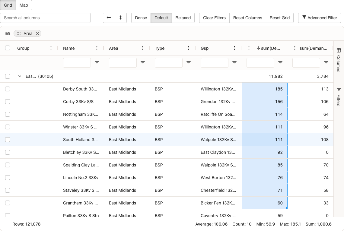
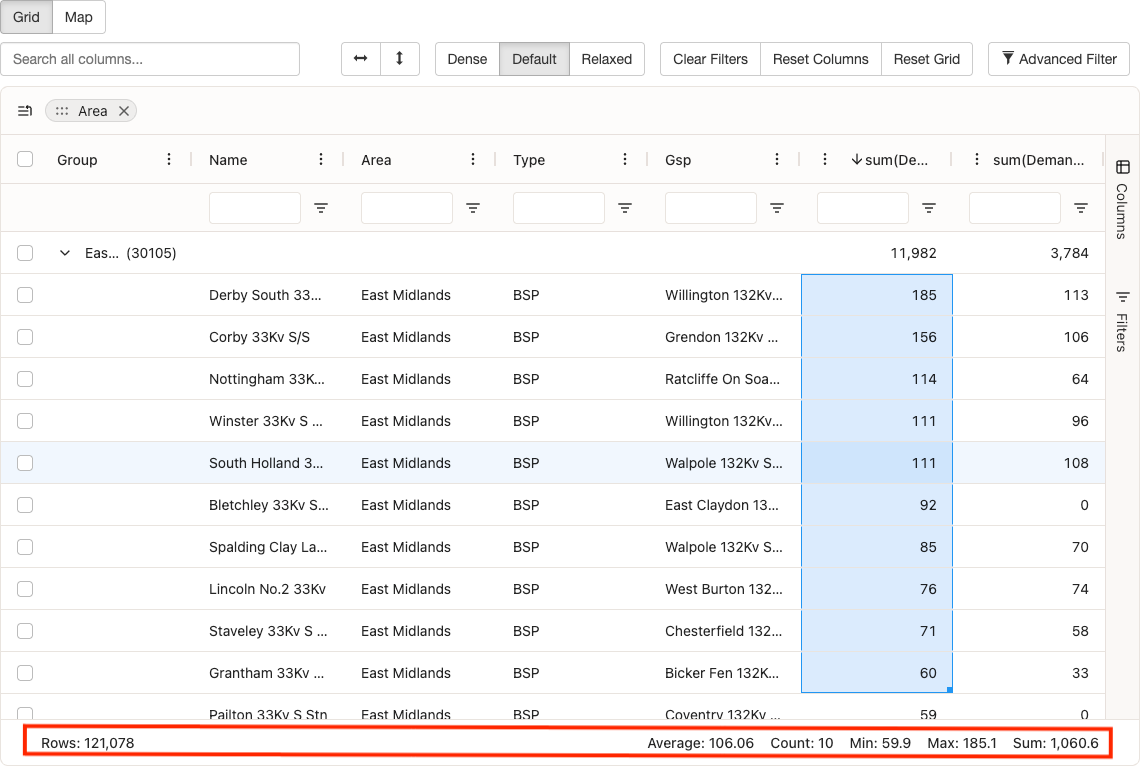
Status Bar
The status bar at the bottom of the grid shows a summary of the current state: how many rows are displayed, how many are selected, and any aggregation values when row grouping is in use.
Key features:
- Row Counts: Total and filtered row counts
- Selected Row Count: Number of currently selected rows
- Aggregation Values: Summary statistics for aggregated columns
Sidebar
The sidebar gives you a single place to manage columns and filters. Open it from the toolbar to show or hide columns, set up row grouping and aggregation, or view and edit all active filters.
Key features:
- Columns Panel: Manage column visibility, grouping, pivoting, and aggregation
- Filters Panel: View and manage all active filters in one place
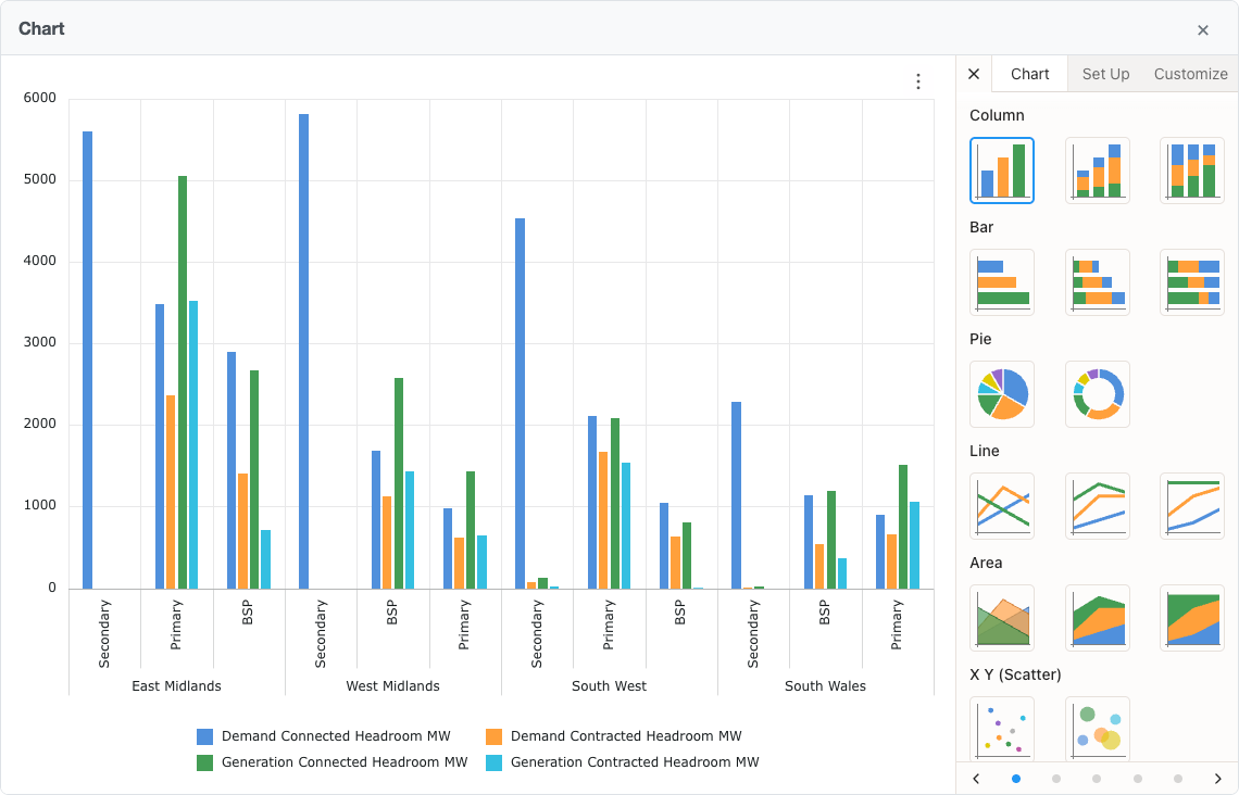
Integrated Charts
You can create charts directly from the grid data. Select a range of cells, then use the context menu to create a chart. Charts appear in a dedicated container and you can have several open at once. Bar, line, pie, and other chart types are available.
Learn more about integrated charts on the dedicated help page.
Key features:
- Chart Creation: Create charts from selected data ranges via the context menu
- Chart Types: Various chart types available (bar, line, pie, etc.)
- Chart Container: Charts render in a dedicated container with header and close button
- Chart Management: Multiple charts can be created and managed independently
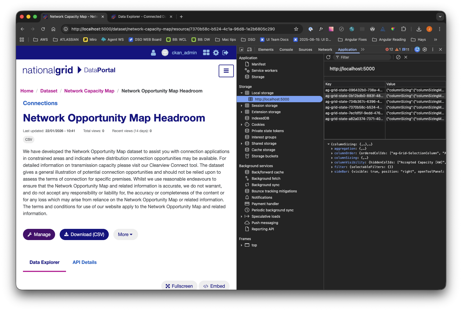
Saved preferences
The grid automatically saves your preferences in your browser so that when you return to the same dataset, your column layout, filters, sorting, grouping, and sidebar state are restored.
Tip: If you want to clear your saved preferences, you can do so by clearing your browser's localStorage for this site. Note that if you do this, you may lose other settings related to this site.
Key features:
- Column State: Column order, sizing, visibility, and pinning
- Filter State: All active filters (column filters, quick filter, advanced filter)
- Sort State: Column sorting configuration
- Grouping State: Row grouping and aggregation settings
- Sidebar State: Sidebar panel visibility
Data Loading
Data is loaded from CKAN's DataStore API (Application Programming Interface) when you open the grid. The grid fetches the full dataset (without pagination) and shows a loading indicator while fetching. The grid uses virtual scrolling to handle large datasets efficiently.
This approach is important because it allows you to access and analyze all available data in one seamless view, without the need to page through results. By loading the complete dataset into the grid and using virtual scrolling, you can quickly sort, filter, and perform analytics across the whole dataset, even if it contains thousands of rows. This ensures an interactive, smooth experience when exploring large or complex datasets.
Key features:
- Full Dataset Loading: The grid fetches all data from the DataStore API without pagination
- Loading Indicator: A custom loading spinner displays while data is being fetched
- Large Dataset Support: Optimised for handling large datasets with virtual scrolling
Accessibility
The Data Explorer is designed to be usable with the keyboard and with assistive technologies. You can navigate and interact with the grid using the keyboard, and screen readers receive appropriate ARIA labels and roles. Focus order and focus indicators follow logical patterns.
Key features:
- Keyboard Navigation: Full keyboard support for navigating and interacting with the grid. Use Tab to move between interactive elements, Arrow keys to navigate cells, Enter or Space to activate buttons and sort columns, and Escape to close dialogs and menus
- Screen Reader Support: Proper ARIA (Accessible Rich Internet Applications) labels and roles for assistive technologies. All interactive elements have descriptive labels, and the grid structure is announced to screen reader users
- Focus Management: Logical tab order and visible focus indicators. Focus is clearly visible on all interactive elements, and focus order follows the visual layout