Integrated Charts
Overview
The Integrated Charts feature allows you to create visualisations directly from your grid data. You can select ranges in the data grid and generate various chart types to explore patterns, trends, and relationships in your data. Charts are displayed in a dedicated area below the grid, and you can create new charts from different data selections.
Learn more about the grid on the dedicated help page.
Key features:
- Chart Creation: Create charts from selected data ranges via the context menu
- Multiple Chart Types: Support for bar, line, pie, area, scatter, and other chart types
- Chart Configuration: Customise chart appearance, axes, legends, and data series through the chart settings panel
- Interactive Charts: Hover to see data values and interact with chart elements
- Single Chart Display: One chart can be displayed at a time in the chart container
Creating Charts
To create a chart, first select the data you want to visualise in the grid. You can select a range of cells, entire rows, or specific columns. Once your data is selected, right-click to open the context menu and choose the chart type you want to create. The chart will appear below the grid.
Key features:
- Data Selection: Select a range of cells that contain the data you want to chart
- Context Menu: Right-click on selected data to access chart creation options
- Chart Type Selection: Choose from available chart types (bar, line, pie, etc.)
- Automatic Data Detection: The system automatically detects which columns should be used for categories and values based on the column data types configured in the grid
- Column Headers: Column headers from the grid are automatically used as axis labels and series names in the chart
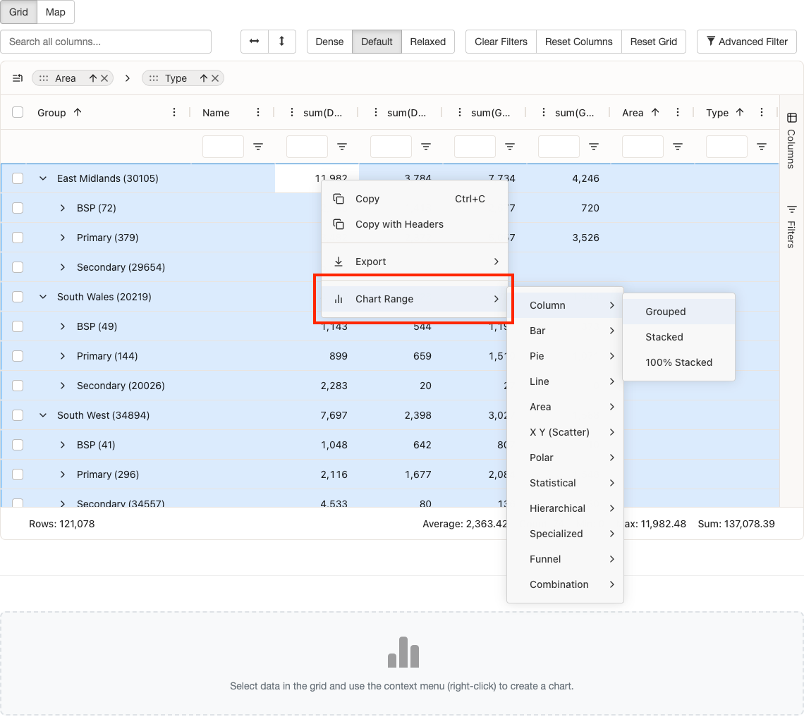
Chart Types
Various chart types are available to suit different data visualisation needs. Each chart type is optimised for specific use cases and data patterns. Choose the chart type that best represents your data and helps convey your insights effectively.
Key features:
- Bar Charts: Ideal for comparing values across categories. Supports horizontal and vertical orientations, grouped and stacked variations.
- Line Charts: Best for showing trends over time or continuous data. Supports multiple series and area fill options.
- Pie Charts: Useful for showing proportions and percentages of a whole. Supports donut charts and multiple pie charts.
- Area Charts: Similar to line charts but with filled areas, useful for showing cumulative values or stacked data over time.
- Scatter Charts: Excellent for showing relationships between two numeric variables and identifying correlations.
- Combination Charts: Combine multiple chart types (e.g., bar and line) to show different data series in a single chart.
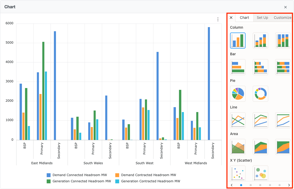
Chart Configuration
Once a chart is created, you can customise its appearance and behaviour through the chart settings panel. The settings panel provides options to adjust chart type, data series, axes, legends, and other visual elements to create charts that best represent your data.
Key features:
- Chart Settings Panel: Access the settings panel to configure various aspects of your chart
- Chart Type: Change the chart type after creation (bar, line, pie, etc.)
- Data Series: Configure which columns are used as categories, series, and values
- Axis Configuration: Customise axis labels, scales, and formatting for numeric and category axes
- Legend: Show or hide the legend, and configure its position
- Colours: Customise the colour scheme for data series
- Visual Elements: Adjust grid lines, tooltips, and other visual elements
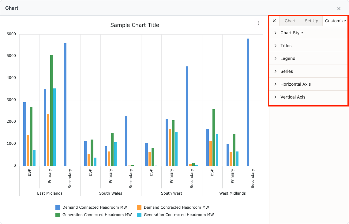
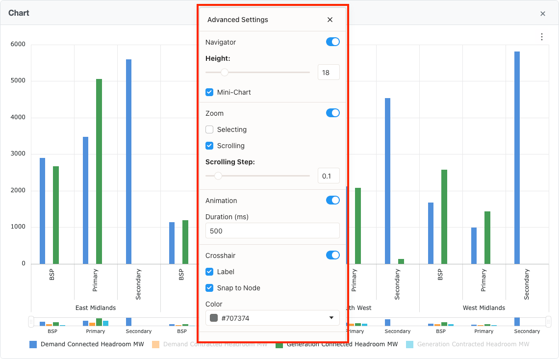
Chart Interaction
Charts are interactive, allowing you to explore your data in detail. Hover over chart elements to see data values, click to highlight specific data points, and use zoom and pan features to focus on specific areas of your chart.
Key features:
- Hover Tooltips: Hover over chart elements to see detailed data values and labels
- Zoom and Pan: Zoom into specific areas of the chart and pan to explore different regions
- Legend Interaction: Interact with legend items to show or hide corresponding data series (if supported by the chart type)
- Download Chart: Download the chart as an image
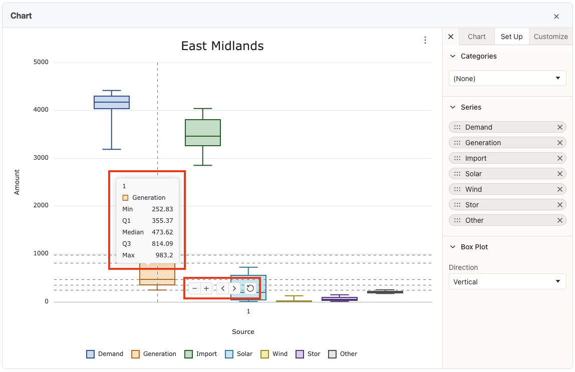
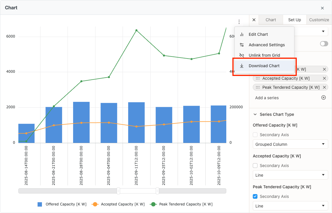
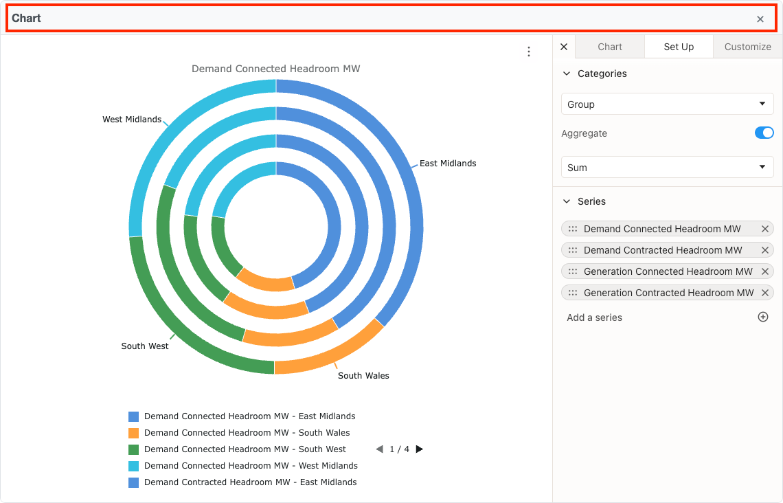
Chart Management
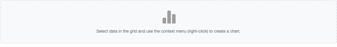
Charts are displayed below the grid. You can close the current chart to create a new one from different data. The chart container shows a placeholder message when no chart is displayed.
Key features:
- Chart Container: Charts appear below the grid with a header showing the chart title
- Close Chart: Use the close button in the chart header to remove the current chart
- Single Chart Display: Only one chart is shown at a time
- Placeholder Message: When no chart is displayed, the container shows a placeholder
Best Practices
Follow these guidelines to create effective and meaningful charts that clearly communicate your data insights.
Key features:
- Data Selection: Select a range of cells that includes clear categories and numeric values. Column headers from the grid are automatically used for axis labels and legend names.
- Chart Type Selection: Choose chart types that match your data structure and the story you want to tell. Use bar charts for comparisons, line charts for trends, and pie charts for proportions.
- Clear Labels: Ensure your chart has a descriptive title and that axes are clearly labelled with units where appropriate.
- Colour Usage: Use colours consistently and ensure sufficient contrast for accessibility. Avoid using too many colours in a single chart.
- Data Volume: For pie charts, limit the number of segments to maintain readability. For line and bar charts, consider grouping or aggregating data if you have too many data points.
- Filtering: Apply filters to your grid data before creating charts to focus on specific subsets of data and create more meaningful visualisations.